
Essential UI Components for Translation Apps
A clean and intuitive translation app interface relies on familiar UI components like language selectors and input fields to guide users effortlessly from input to translated output. Good UI/UX design reduces friction and makes translation tools accessible to all users. In translation apps, user interface (UI) components—dropdowns, buttons, forms, and toggles—are crucial for usability. For instance, a prominent language selector allows users to switch languages easily, directly improving satisfaction. Clear components and accessible design ensure people of all abilities can use the app (e.g., Google Translate “does not rely on color alone” and uses large tappable areas for inclusivity). Focusing on essential UI components for translation apps ultimately boosts user retention and engagement.
Why UI Matters
Good UI design in a translation app leads to less user frustration and faster task completion. Experts recommend reducing friction by simplifying flows—such as eliminating unnecessary steps when translating text or using voice. A mobile-first design is essential, as many users rely on smartphones: use concise labels and minimal navigation so controls don’t overcrowd the screen.
Support for multilingual users is vital. While auto-detection (from device locale or IP) can help start in the correct language, it may fail in certain situations (VPNs, travelers). Always provide a manual language switch. A streamlined UI with clear language options and straightforward navigation drastically improves the user experience.
Essential UI Components
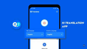
Language Selector Dropdown

- Placement & Design: Use a clear dropdown or modal listing source/target languages. Place it in an obvious spot (typically in the top header or footer). If your app supports many languages, include a search bar in the selector.
- Flags and Labels: While flags can help indicate countries, remember that flags aren’t languages. Best practice is to show the language name in its native form (e.g., “Español”). If using flags, pair them with language labels or ISO codes to avoid misinterpretation.
- Auto-Detect: Offer an “Auto-detect” option for the input language. However, always provide an override. As Localizely notes, “IP-based or browser settings may not always be accurate.” Manual selection ensures reliability.
- UX Tips: Use a globe icon or the word “Language” to make the selector stand out. Follow familiar UI patterns like dropdown arrows or modal lists. Make sure the selected language is clearly labeled. Dropbox’s language selector popover is a great implementation example.
Text Input and Output Fields
- Bidirectional Support: Design fields to support both left-to-right and right-to-left scripts. For RTL languages (Arabic, Hebrew), the layout should mirror accordingly: navigation, alignment, and button placement.
- Field Size: Provide a large, scrollable input area. In usability tests, users criticized Google Translate’s small input box. Allow multi-line expansion so users can comfortably edit longer text.
- Action Buttons: Include buttons for copying, sharing, or clearing the translation. Add tooltips or text labels to icons (e.g., for the copy icon), as usability tests found users often didn’t understand ambiguous symbols.
- Language Switch/Swap: Include a one-tap option to swap source and target languages, often represented by a swap icon. Clearly label fields as “From” and “To” to reduce confusion.
Voice Input and Speech-to-Text

- Microphone Button: A prominent microphone icon enables speech input. Position it where it’s easy to access (e.g., bottom center), and ensure the touch target is at least 44×44 dp.
- Feedback: Show visual indicators (e.g., a waveform or color change) while listening. This provides reassurance that speech is being captured.
- Permissions: Prompt microphone permissions with a clear explanation (“Needed to convert speech to text”) and follow platform-specific guidelines.
- Accuracy Matters: Voice input significantly boosts usability—62% of users prefer voice commands over typing. Provide retry options if transcription is incorrect.
Audio Playback

- Pronunciation Audio: Add a speaker icon to play the translated text. Show a waveform or progress bar to indicate audio playback.
- Controls: Offer play/pause functionality and consider playback speed controls, which benefit language learners. Make controls large and clearly labeled.
- Visual Cues: Animated waveforms during playback create a more engaging experience and help users follow along.
Camera & OCR
- Scanning UI: For OCR input, guide users visually with an overlay frame in the camera view. Prompt text like “Align text within the box” helps.
- Auto-Capture: If the text is well-aligned, auto-capture it. Highlight recognized text for user confirmation or editing.
- Retakes and Feedback: Allow users to retake scans and show a loading indicator. Include flash/focus options and tips like “Hold steady” for better results.
Live Translation Toggle

- Conversation Mode: For two-way voice translation, add a clear toggle between “Dictation” and “Conversation” modes. Google found labeled buttons improved usage significantly.
- UI: Use alternating text blocks or bubbles to display translations, similar to chat interfaces. Color-code or label each side by language.
- Controls: Provide a large “Start/Stop Conversation” button and mic indicators (e.g., a glowing border) to show active listening.
History & Favorites

- Translation History: Let users access past translations in a timeline with timestamps and language tags. Include a search bar for filtering.
- Favorites: Allow users to save translations with a labeled star icon. Organize favorites in a separate tab.
- Filters: Enable filtering by date, language, or favorites. Google’s collapsible timeline UI is an effective example.
- Clear and Export: Provide options to clear history or export favorite entries for reference.
Offline Indicators

- Offline Icon: Display a clear offline icon (e.g., cloud with a line) and label it. Place it in a visible area like the status bar.
- Disabled Features: Gray out unavailable features and show a message such as “No connection – using offline translations only.”
- User Feedback: Notify users when connectivity changes with a brief toast message (e.g., “You’re offline. Translations will sync once connected.”).
- Offline Content: Show which languages are available offline, using a download icon. This is helpful for travelers.
Progress Indicators
- Spinners and Bars: Use simple spinners or bars for quick processes, always paired with text like “Translating…” to set expectations.
- Skeleton Loaders: For longer operations, skeleton loaders provide perceived progress. These mimic the layout of upcoming content.
- Animation: Animated loaders (pulsing or shimmering) assure users the app is working.
- Contextual Loading: Use skeletons in areas where content will appear—not just as isolated icons—to improve clarity.
Accessibility in UI
Make your app inclusive for all users:
- Contrast and Color: Use high-contrast text (WCAG recommends a 4.5:1 ratio). Don’t rely on color alone to convey meaning—use icons or labels too.
- Screen Reader Labels: Ensure every button and icon has an accessible label. Google Translate clearly labels icons for screen readers.
- Tap Targets: Use touch targets of at least 44×44 pixels—48×48 is better for accessibility.
- Font and Layout: Support zooming and larger text. Use readable fonts and ample padding to avoid crowding.
- Consistent Layout: Maintain predictable structure and navigation. Descriptive headers help users using assistive technologies.
Localization and Internationalization
- Flexible Text: Design layouts to accommodate longer strings in languages like German or Arabic. Avoid fixed-size containers—use responsive design.
- String Translation: Store UI copy in resource files, not images. Give translators context to ensure accurate translations.
- Locale Formats: Format dates, numbers, and currencies according to the user’s locale. Use localization libraries for accuracy.
- Right-to-Left Support: Mirror layouts and animations for RTL languages. Align text to the right and adapt menus accordingly.
- Cultural Adaptation: Use culturally appropriate icons, names, and examples. Avoid symbols that don’t translate universally.
Mistakes to Avoid
- Misleading Icons: Avoid ambiguous icons. Flags don’t represent languages, and unlabeled symbols (like stars) confuse users. Add tooltips or text.
- Cluttered Interface: Don’t overload screens. Group related functions and focus each screen on one main task.
- Vague Error Messages: Replace technical errors with friendly, clear messages. Suggest solutions, like “Please check your internet connection.”
- No Feedback: Always provide visual or haptic feedback after user actions. Prevent errors with proactive design (e.g., disable unavailable options).
Future UI Trends
Future translation apps will embrace AI-enhanced UI components. Expect predictive and zero-click interfaces that suggest phrases based on context. Voice and gesture controls will become standard—users may swipe or nod to confirm translations. Augmented reality (AR) could overlay subtitles on real-world visuals. Keep your UI flexible, combining traditional components with next-gen features like chat-style conversation windows or context-aware suggestions.
Conclusion
Focusing on essential UI components for translation apps—from language selectors and text fields to voice and history tools—ensures a smoother user experience. Reduce friction, support multiple languages, and adhere to accessibility standards to make your app more inclusive and usable. Always test your UI with real users and iterate based on feedback. A clean, intuitive interface can make the difference between an app that succeeds and one that gets abandoned. For expert help in crafting or improving your translation app’s UI/UX, consult a professional design team. With the right components and thoughtful execution, your app can break language barriers and connect the world.
Stay connected with us on HERE AND NOW AI & on